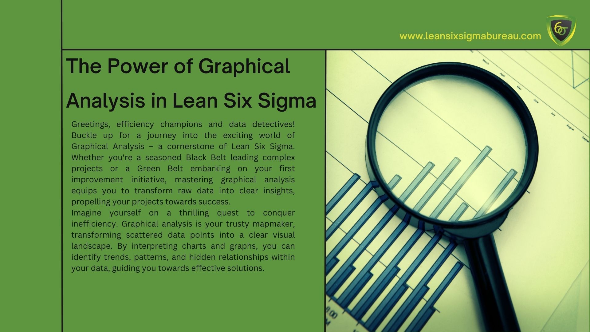
Greetings, efficiency champions and data detectives! Buckle up for a journey into the exciting world of Graphical Analysis – a cornerstone of Lean Six Sigma. Whether you’re a seasoned Black Belt leading complex projects or a Green Belt embarking on your first improvement initiative, mastering graphical analysis equips you to transform raw data into clear insights, propelling your projects towards success.Imagine yourself on a thrilling quest to conquer inefficiency. Graphical analysis is your trusty mapmaker, transforming scattered data points into a clear visual landscape. By interpreting charts and graphs, you can identify trends, patterns, and hidden relationships within your data, guiding you towards effective solutions.
Why is Graphical Analysis So Important in Lean Six Sigma?Data is the lifeblood of Lean Six Sigma. But raw data can be overwhelming and difficult to interpret. Graphical analysis bridges this gap by presenting data in a visually compelling way. Here’s why it’s essential:
Enhanced Understanding: Complex data becomes easier to grasp through charts and graphs. Visualizations allow you to see patterns and trends that might be missed in spreadsheets.
Improved Communication: Sharing insights with stakeholders is more effective with clear visuals. Charts and graphs can simplify complex data and ensure everyone is on the same page.
Data-Driven Decision Making: Visual representations help you identify areas for improvement and make informed decisions based on factual evidence.
Identifying Relationships: Charts can reveal correlations between variables, helping you understand how different factors influence your process.
Problem-Solving Efficiency: Spotting trends and outliers visually allows you to pinpoint potential problems faster and more efficiently.
Your Visual Toolkit: Essential Graphs for the Lean Six Sigma ChampionJust like a skilled artist has a variety of tools, your Lean Six Sigma toolbox boasts a range of powerful graphical analysis techniques. Here are some key charts you’ll encounter:
Histogram: This versatile chart depicts the frequency distribution of data, revealing how data points are spread out. It helps you identify potential skewness or outliers.
Pareto Chart (80/20 Rule): This chart visually highlights the most frequent and impactful causes of a problem. It allows you to prioritize your efforts on addressing the “vital few” causes.
Box Plot: This chart summarizes data distribution by displaying quartiles and outliers. It helps you compare data sets and identify potential variations.
Run Chart: This time-series chart tracks a specific measure over time, allowing you to identify trends, shifts, and potential areas of improvement.
Scatter Plot: This chart reveals the relationship between two variables, helping you identify correlations or patterns.
Control Chart: These specialized charts monitor process stability over time. They help you identify deviations from expected behavior and potential areas for improvement.
Choosing the Right Chart for the Job: A Guide for Data Visualization ChampionsWith so many options, selecting the right chart can feel overwhelming. Here’s a cheat sheet to guide you:
For understanding data distribution: Histogram
For prioritizing problem causes: Pareto Chart
For comparing data sets: Box Plot
For identifying trends over time: Run Chart
For revealing relationships between variables: Scatter Plot
For monitoring process stability: Control Chart
Beyond the Basics: Advanced Techniques for the Discerning AnalystAs you progress on your Lean Six Sigma journey, you’ll encounter more advanced graphical analysis techniques, such as:
Gantt Chart: Tracks project timelines and resource allocation.
Cause-and-Effect Diagram (Ishikawa Diagram): Visually maps potential causes of a problem categorized by factors like people, machines, methods, materials, and environment.
FMEA (Failure Mode and Effects Analysis) Chart: Identifies potential failure modes in a process and their impact on the customer.
Sharpening Your Skills: Tips and Tricks for Effective Graphical AnalysisCrafting clear and informative visuals is an art form. Here are some tips to elevate your graphical analysis game:
Focus on Clarity: Keep your charts simple and easy to understand. Avoid overloading your visuals with excessive information.
Choose Clear Titles and Labels: Ensure your charts have clear titles and labels that accurately represent the data being displayed.
Use Consistent Formatting: Maintain a consistent visual style across your charts for a professional and cohesive look.
Highlight Key Insights: Use elements like arrows or annotations to emphasize important findings within your charts.
The Power of Seeing Clearly: Unleashing the Potential of Graphical AnalysisBy mastering graphical analysis, you unlock a powerful tool for data interpretation and communication in your Lean Six Sigma projects. You’ll gain valuable insights that would otherwise remain hidden in spreadsheets, empowering you to make data-driven decisions, identify areas for improvement, and ultimately achieve.
English
English
Dutch
Polish
English
English
Dutch
Polish
Report
There was a problem reporting this post.
Block Member?
Please confirm you want to block this member.
You will no longer be able to:
See blocked member's posts
Mention this member in posts
Invite this member to groups
Message this member
Add this member as a connection
Please note:
This action will also remove this member from your connections and send a report to the site admin.
Please allow a few minutes for this process to complete.